No H1 anywhere on the homepage
The first heading is an H4, and the order runs h4 to h2 to h4. No primary topic signal for a page competing on local adoption search.
C.A.R.E. is a thirty-year-old, all-volunteer, no-kill rescue on Chicago's North Shore. Its adoption center is open to the public nine hours a month.
That number governs everything. With no paid staff on the floor, every question the website fails to answer becomes a phone call, and every phone call is an hour taken away from animal care. The site's most valuable function is not persuasion. It is answering the question before a person has to ask it.
The redesign is built around one fact the existing site never states: some animals live at the center in Skokie, and some live in foster homes across the North Shore. Nothing told you which, so people drove to a nine-hour window to meet a dog that was twelve miles away.
What follows is a walkthrough of the working prototype — built in HTML, CSS and JavaScript, not mocked. Every screen below is live.
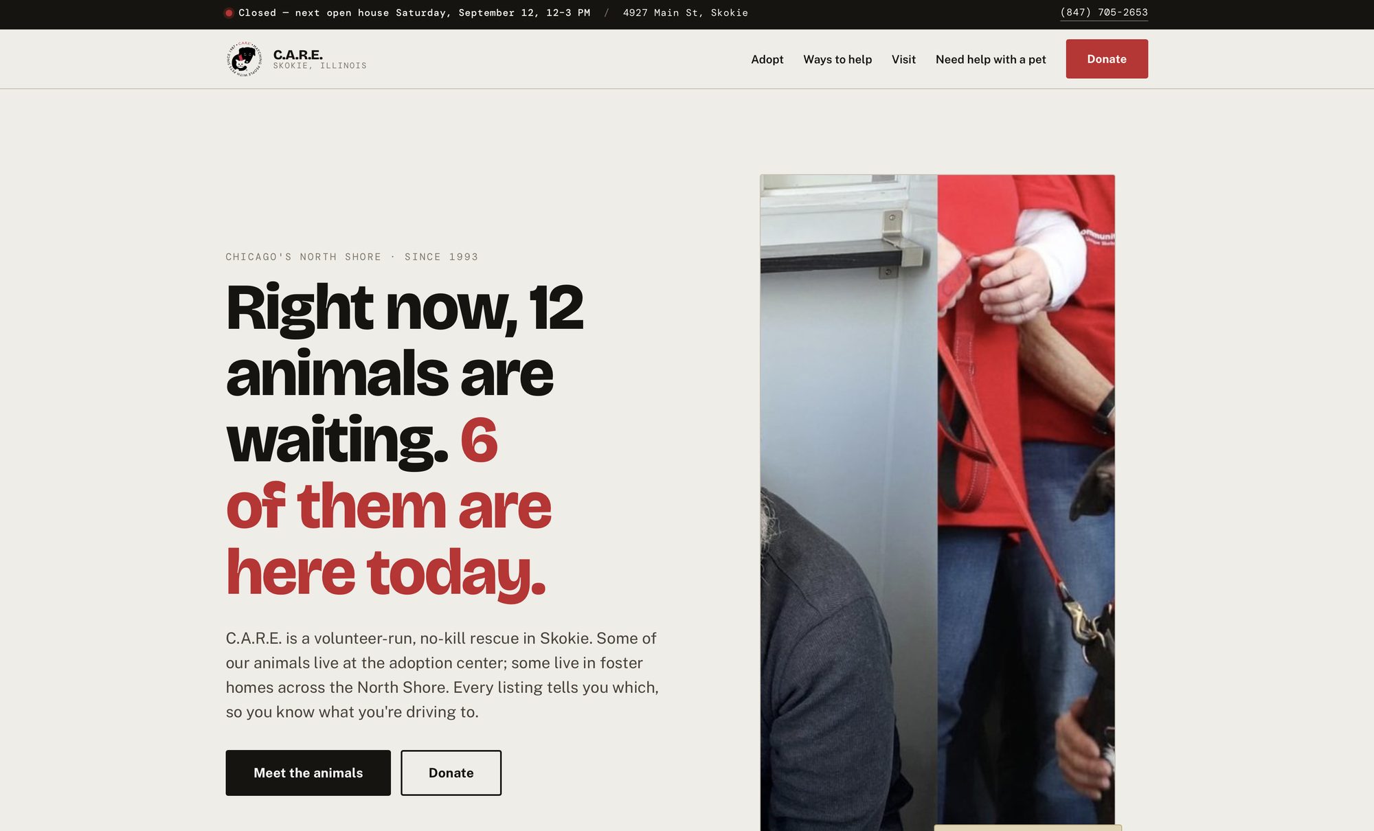
The existing hero rotates five equally weighted calls to action with all of its copy set inside the images — no alt text, nothing selectable, nothing indexable. This is one headline, one primary action, and live text.
The bar above the header computes whether C.A.R.E. is open right now in Chicago time and prints the next qualifying Saturday. The counts in the headline read from the animal data, so they cannot drift the way the current site's statistics did — those are still showing 2018 figures.
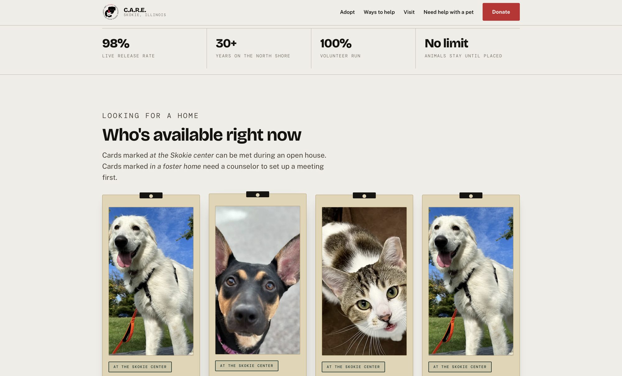
Four figures that stay true. The organization's strongest trust asset — a live release rate above 98 percent, and a limited-access, unlimited-stay policy — was buried three levels deep in an About page. It belongs directly beneath the headline.
Below it, the animal rail. The current homepage shows no animals at all; cats and dogs sit two levels down in a hover menu.
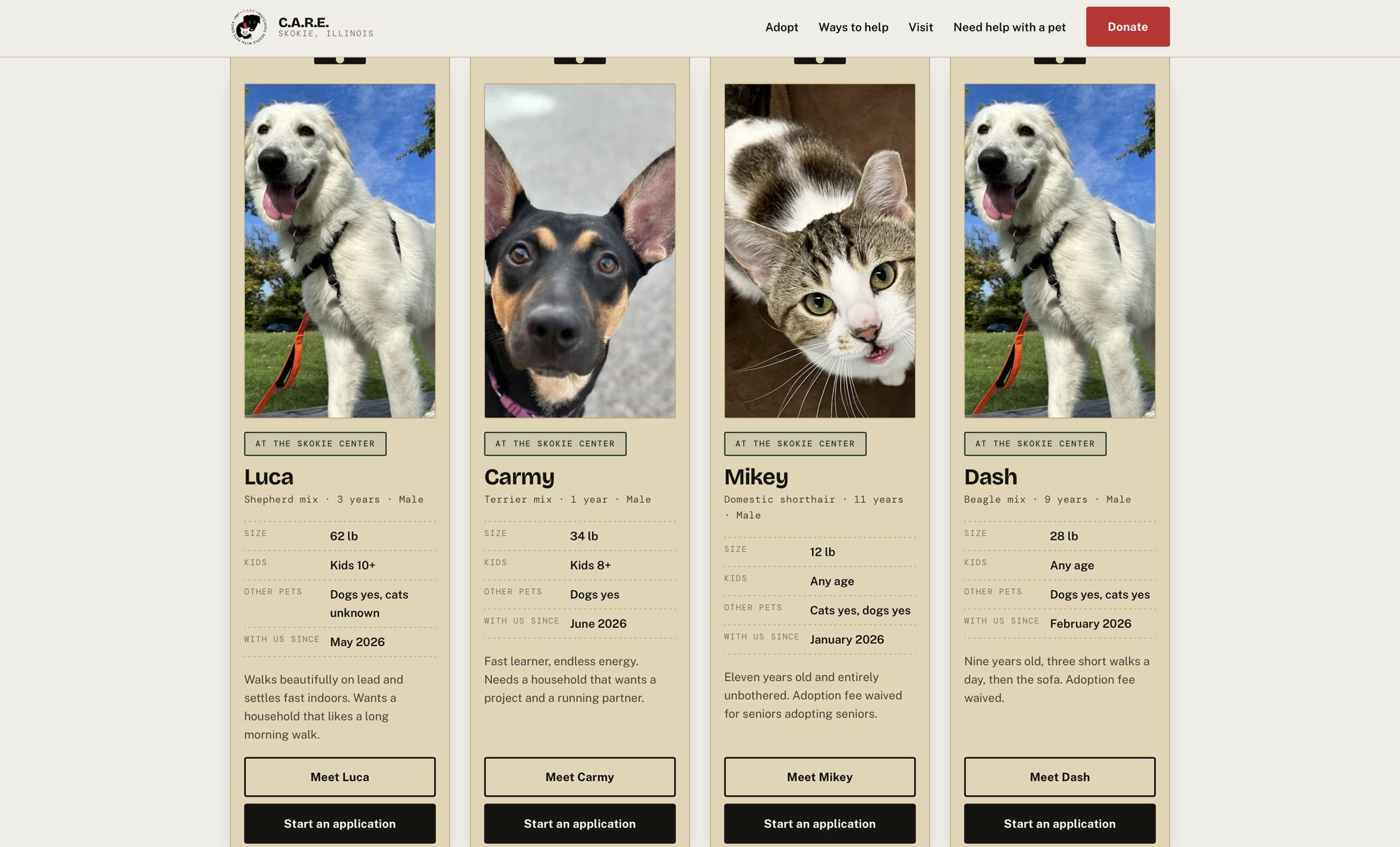
The card clipped to the front of an enclosure is the most characteristic object in a rescue's world — manila stock, typed field labels, a stamped status. Making it the primary component meant the structure could carry the fact rather than decorate around it.
Every card is stamped at the Skokie center, in a foster home, or adoption pending. Size, kids, other pets, and time in care sit in a field grid, because those four questions decide whether a visit is worth making.
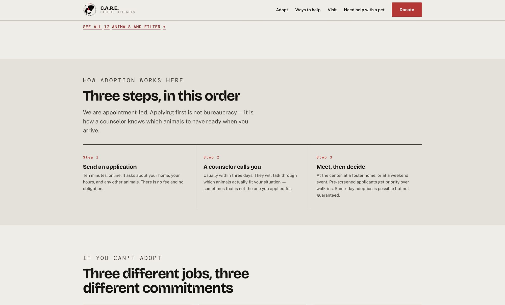
C.A.R.E. sees pre-screened applicants before walk-ins. That sentence currently appears only inside event descriptions, so almost nobody encounters it before arriving on a Saturday.
Numbered markers appear here and nowhere else on the site. This content genuinely is a sequence, and the order carries information the reader needs.
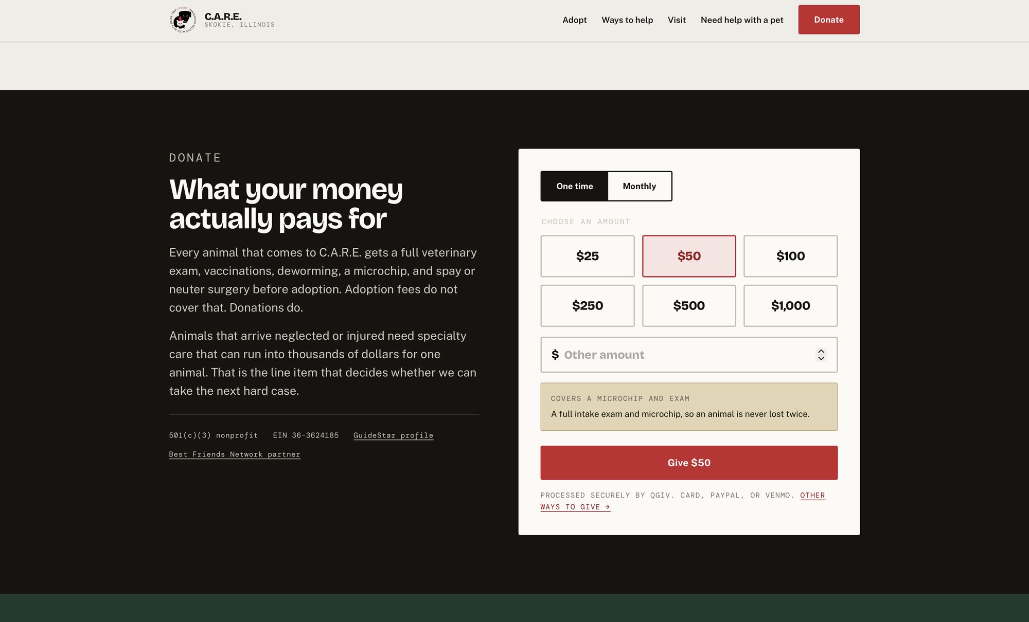
The current site writes “$5 can help provide a vaccine and $25 can provide food and shelter” and attaches no control to it. Here the impact line is bound to the selected amount and updates live.
Donating went from four clicks across three conflicting URLs to one. The 501(c)(3) status, EIN and GuideStar link sit inside the module rather than in the footer, where they currently do no work.
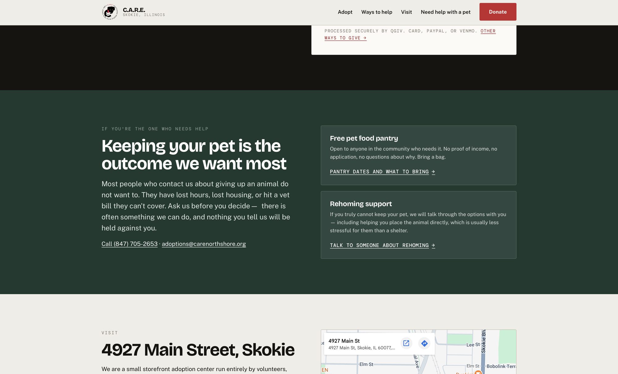
The fourth audience. C.A.R.E. runs a free food pantry and rehoming counseling, both filed on the existing site under Resources — a word that assumes you are browsing. The people reaching for these have lost hours, lost housing, or hit a vet bill, and many are ashamed to be asking.
Its own colour family and its own band on the homepage. The argument that earns it the space is not sentiment: pantry access is upstream surrender prevention. A family kept together is an animal C.A.R.E. never has to house, treat and place.
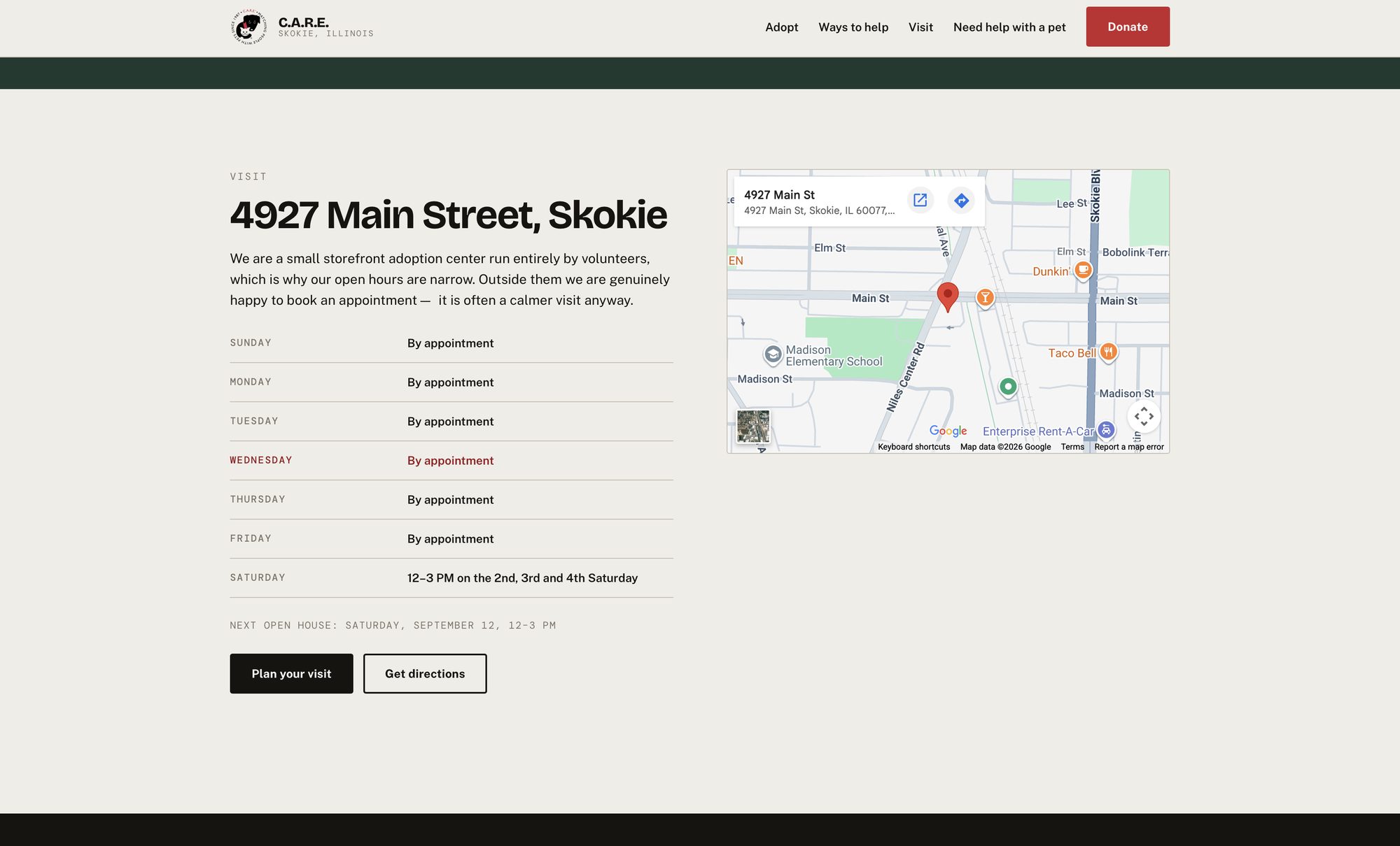
The current hours read “2nd, 3rd, and 4th Saturdays from 12–3 PM, or by appointment only” in italic footer text, leaving the arithmetic to the reader — including five-Saturday months, where both the first and the fifth are closed.
Today's row highlights. The address, phone number and directions are one tap away. The phone number is worth noting: it exists on the organization's Petfinder profile and nowhere on their own website.
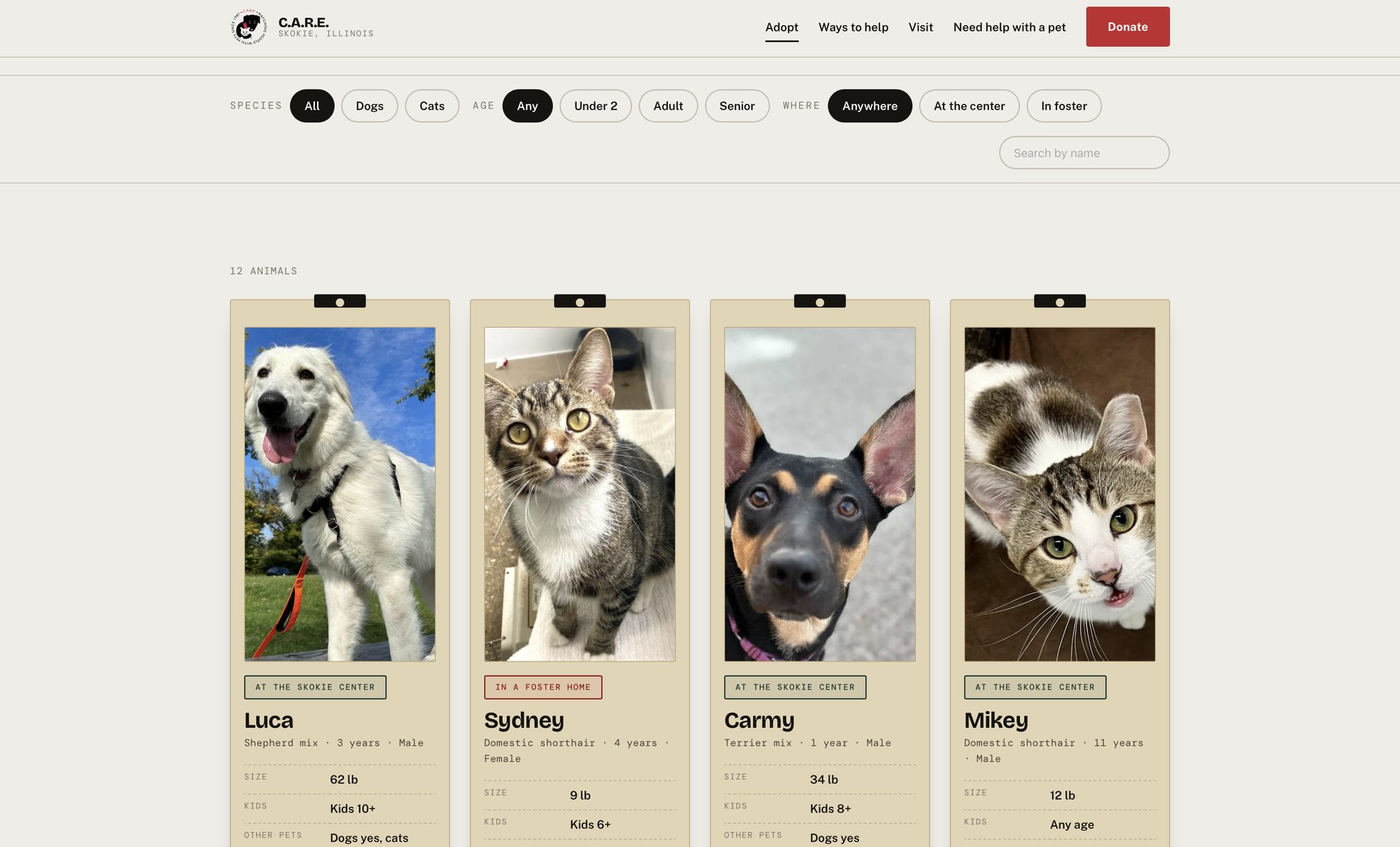
Species, age, and — the filter no rescue site in the benchmark set offered — where the animal physically is. Filtering by at the center is how you plan a Saturday.
The count sits in a live region, so a screen reader hears the result change rather than being left to discover it. Sydney's card is stamped red for foster; the rest are green for on-site.
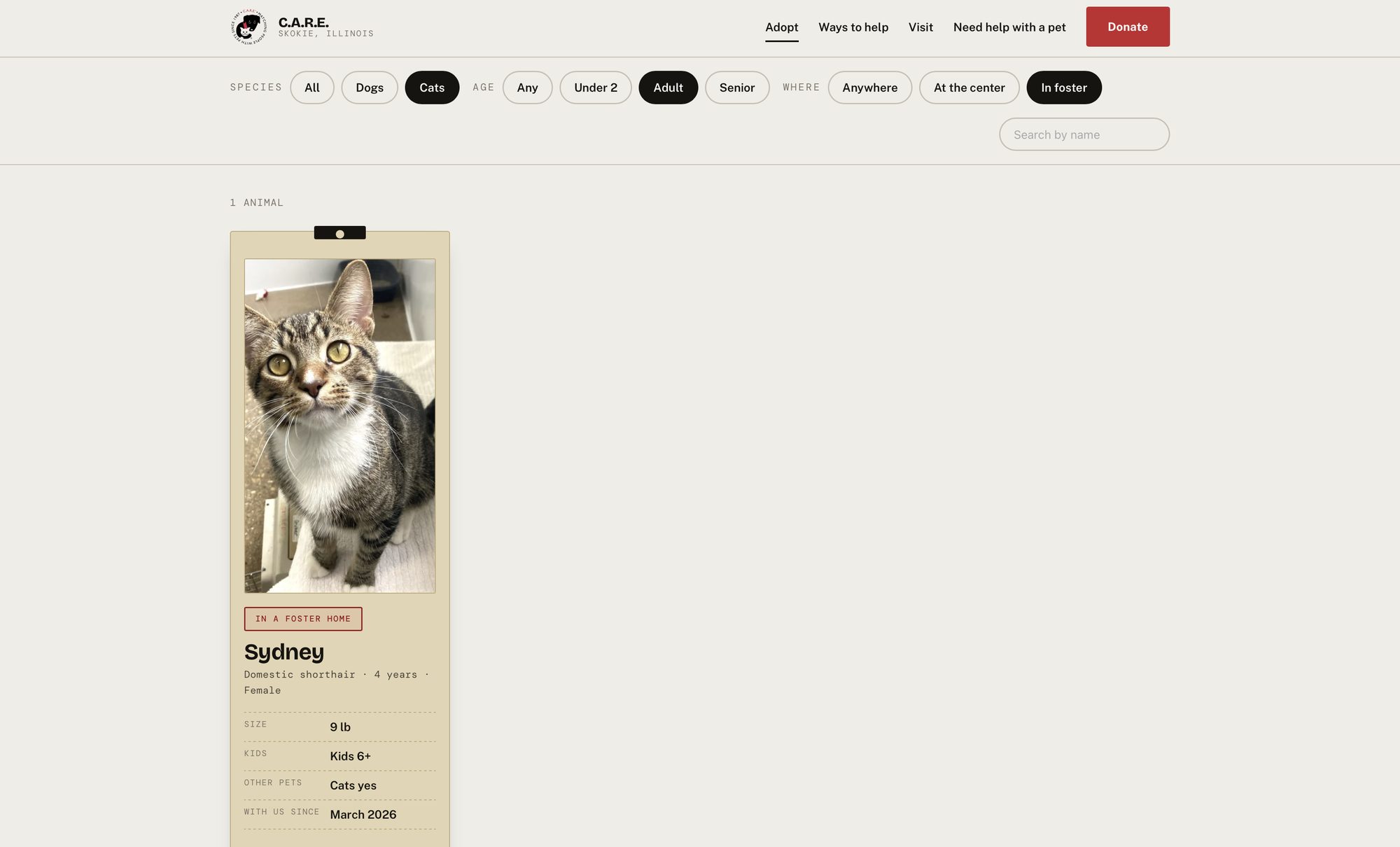
Three filters applied, one result. A shelter holding twelve animals hits narrow and zero-result states constantly, so the empty state explains why the population turns over, offers to take your criteria for when a match arrives, and clears the filters.
A dead end here is a lost adopter — and, for an organization this size, a lost adopter is a measurable outcome.
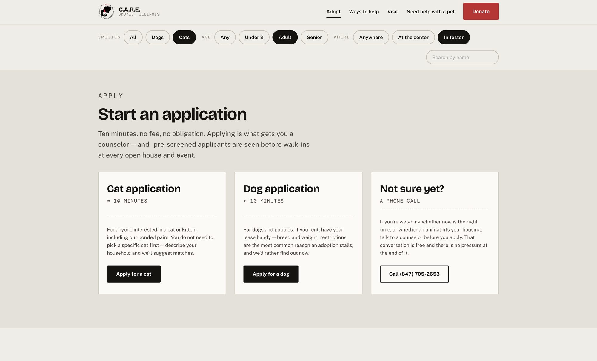
The audit found the site's own navigation pointing applicants at one form while its Petfinder profile pointed them at two others. Two funnels, two sets of instructions, and the one carrying the contact details was the channel the organization does not control.
One section, one canonical path, and a third option for people who are not ready to apply — because the alternative to a premature application is a conversation, not a bounce.
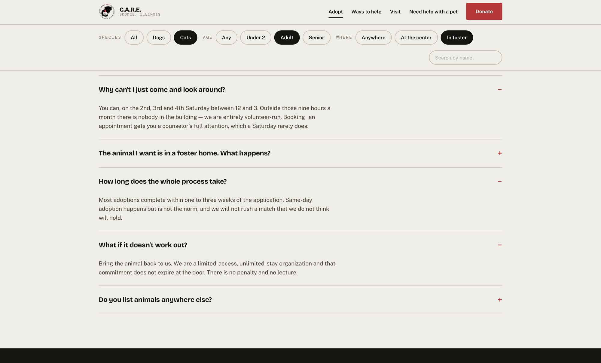
This is the deflection layer. Each question here is one a volunteer currently answers by phone, and the answers do not soften the constraints — nine hours a month, nobody in the building otherwise, no guarantee of a same-day adoption.
Stating a limitation plainly reads as a functioning organization. Hiding it reads as a closed one.
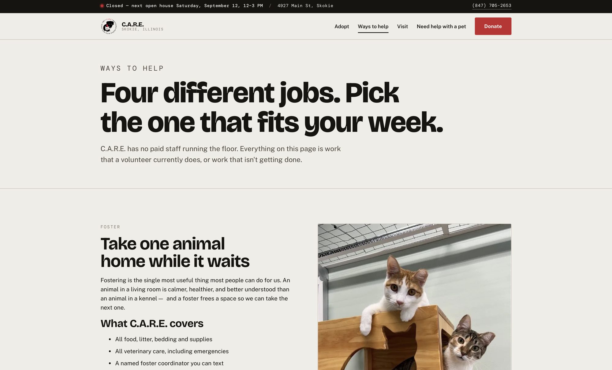
The existing site collapses adopting, fostering and volunteering into a single card labelled Help Us with one Apply button. Three different commitments behind one label.
Split apart, each states its real cost in time before anything else — and the foster section leads with what C.A.R.E. covers, because the two things people assume disqualify them, renting and owning other pets, usually don't.
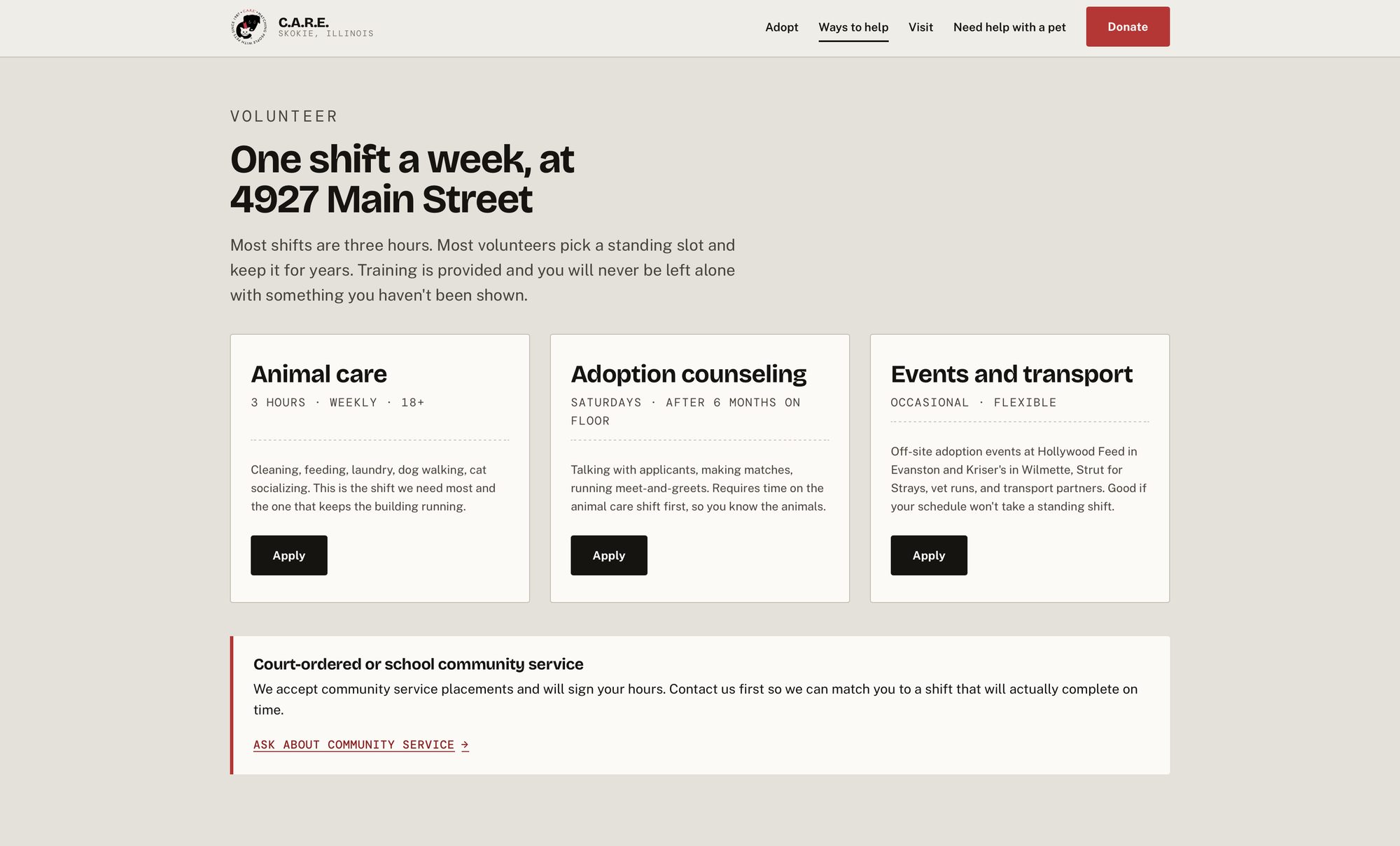
Three hours, weekly, 18+. Saturdays, after six months on the floor. Occasional and flexible. The commitment line runs above the description on every card, because that is the information that decides whether someone reads further.
Court-ordered and school community service gets its own callout rather than a nav item, which is where it currently sits.
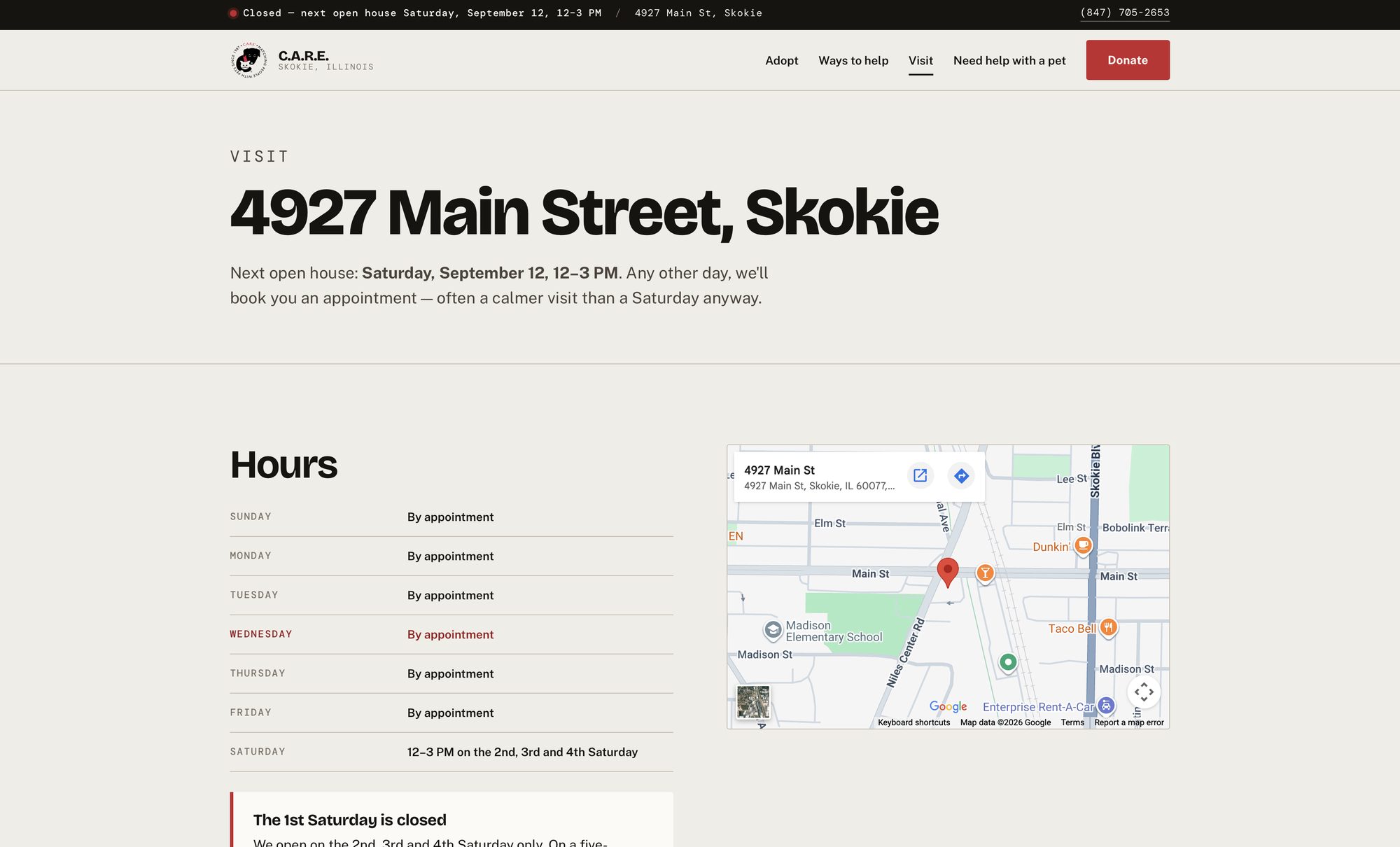
The same computed date, restated where someone deciding whether to drive will look for it. A callout below the table handles the case the current site never addresses: the first Saturday is closed, and on a five-Saturday month the fifth is closed too.
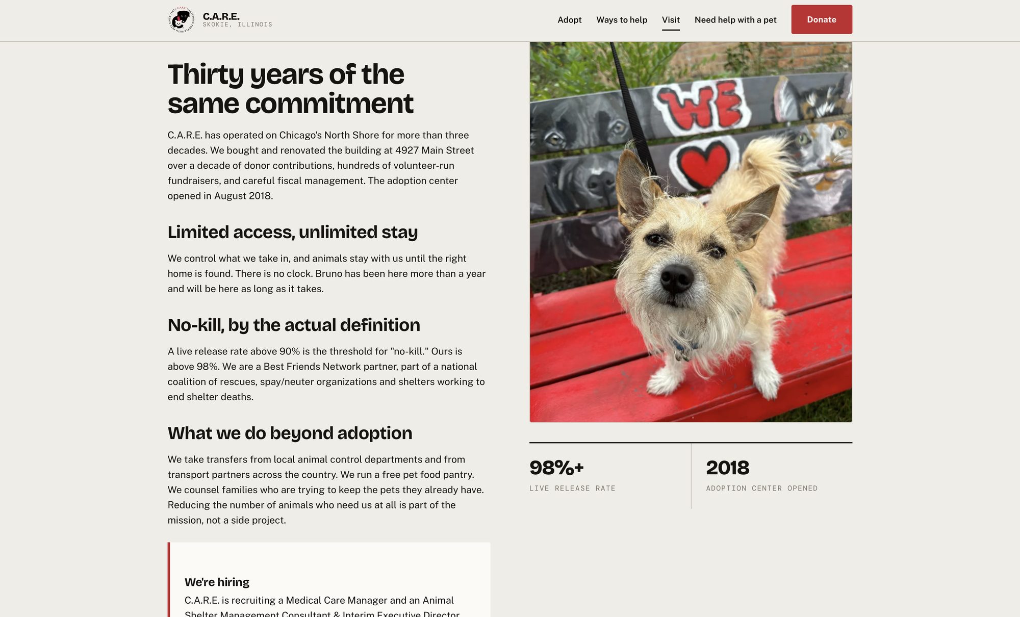
Thirty years, a building bought and renovated over a decade of volunteer-run fundraisers, and a live release rate above the no-kill threshold. All of it currently sits behind a nav folder nobody opens.
Limited access, unlimited stay is the strongest sentence the organization has written about itself, and it names a real dog: Bruno has been there more than a year and will be there as long as it takes.
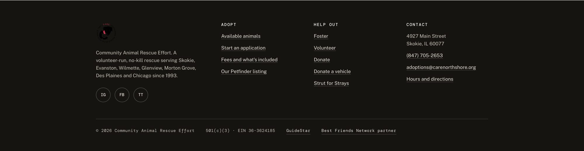
Address, tap-to-call phone number, email, hours, EIN, and labelled social links on every page. The current footer carries none of the first four, and its social links use raw URLs as their accessible name — a screen reader announces the full address, character by character, three times per page.
Every question the site fails to answer becomes a volunteer hour. Volunteer hours are animal care.
Thirty findings, severity-rated against Nielsen's heuristics and WCAG 2.2 AA. The eight worst are below. The remainder — stale impact data, an unlabelled cart control on every page, a header logo requested at 1500px to display at 60, a malformed robots tag, a tribute donation form distributed as a printable PDF — are in the full report.
The first heading is an H4, and the order runs h4 to h2 to h4. No primary topic signal for a page competing on local adoption search.
No alt text and no resolvable source. Every headline on the highest-value real estate exists only as pixels — a WCAG 1.1.1 and 1.4.5 failure at once.
All weighted identically, all auto-advancing. Five equal primary actions is zero primary actions.
The dominant visitor intent for a rescue is seeing the pets. Cats and dogs sat two levels deep in a hover menu.
The hero image, the button beneath it and the nav folder pointed at three different destinations, with no donate button in the header and four clicks to the processor.
The organization's number and adoption email appear on their aggregator profile and nowhere on their own website.
Petfinder routes applicants to one pair of forms; site navigation routes them to another. Three surfaces, three answers.
Foster animals are indistinguishable from on-site animals. The caveat appears once, inside an event description.
Moderated usability testing is scheduled and has not yet run. The findings above are verified defects in the live product and expert-evaluation inferences drawn from them — not measured outcomes. The full research program carries a written protocol, participant screener and measurement framework awaiting fieldwork.